Designing for Digital Layout


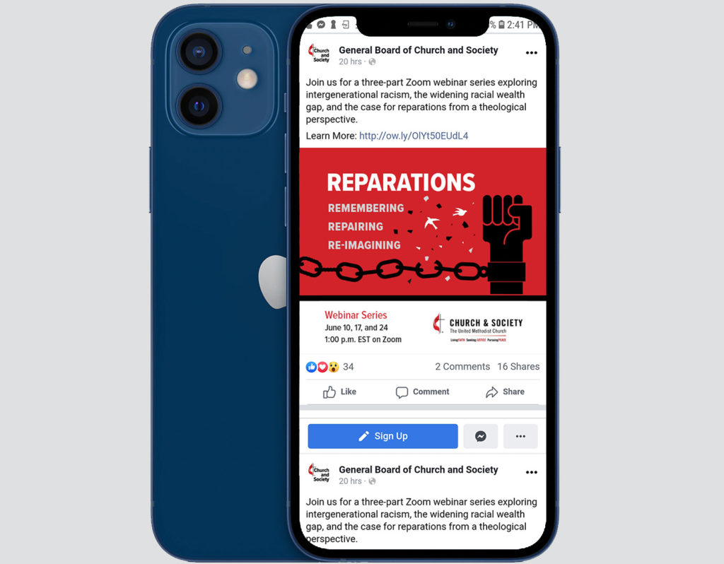
Posting to social media is more fun when you keep default layouts in mind. Meta users can post to Facebook and Instagram simultaneously, but the content is displayed differently on each platform. The challenge is to design a post that will work for both without having to customize your design. In these examples, I thought about how the graphics display on Facebook as a gallery, but also made sure they are friendly to Instagram users that click through the slides one-by-one. 

A grid of four graphics with an explanation of "How to Not Miss It" step on each graphicA gallery of graphics on Facebook that are all different except they have a hand holding a mug in the foreground

Three separate graphics that are displayed on Facebook to reveal the Church logo in the center.

Christmas Harmony


Every Christmas, Pittman Park Church is decorated with wreaths and poinsettia flowers. In designing Pittman Park’s Christmas events promotional materials, I did the same! I wanted to create nostalgia for members that value the traditions of the congregation while inviting newcomers with an authentic representation of the church.

The anchor pieces are the events handout card and the roadside banner. Individual event graphics for the website and presentation slides were created to match. The sermon series program communicates the musical foundation of the messages and matches not only the Christmas events materials but also other recent sermon series graphics.

With these on-brand, meaningful and elegant graphics, the church can easily use the same designs for Christmas events promotion in future years.


Pittman Park Logo inside wreath on left and Events List on right

Caroling with date and time beside poinsettia flower

Hanging of the Greens with date and time inside wreath

Jingle Jam with date and time on striped background with greenery border

Choral Presentation with date and time with large wreath around text

Christmas Eve Communion with date and time above three poinsettia flowers


Not a Mac


My new computer arrived this week! I can now download my new software, set up my desk, and give Touchable Design a proper home.

This is a big step, guys. A computer with the capabilities I need is not cheap. And I’m not one of those graphic designers who leans into the ever-changing intricacies of the required tech. I went into this purchase not even sure what I should buy.

I have enough experience to understand that design does not equal mac anymore. In the interest of economical maintenance and limitless customization, I decided PC was the way to go. Experience has also taught me that a publication designer needs a large screen more than portability.

So, I knew I wanted a tower PC with a large monitor. The only other thing I knew was that I wanted to have it soon!

Fortunately, I have a friend who manages the local University tech store. I emailed him to get his opinion on the computer and peripherals that two hours of Google searching turned up. He replied the next day with a quote for something better and cheaper that would include all the necessary accessories.

Two weeks later, here I am: squeezing in a grateful blog post as I crank out designs for my first two nation-wide projects.

desk with big computer


If you are in Statesboro and looking for a new computer or tech accessories, head straight to Tech Corner on campus. They can’t be beat!